Project Description
The Challenge
Atchison Heller came to us with the need to brand their new custom home development, Harper Woods. They were looking for branding and messaging that helped convey the rich history of the development, the feeling of community and the safety and convenience the neighborhood provided.

The Plan
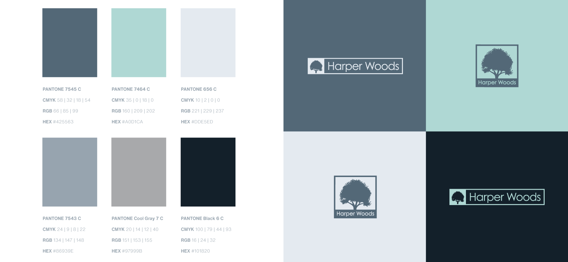
In order to create a logo and branding that truly spoke to the brand, we started with the messaging and what we wanted the brand to truly stand for. We pitched three logo topics to the client and landed on a concept that is based on the community aspect of Harper Woods and the historic Bur Oaks in the neighborhood. This concept is our way of visualizing the focal point of the Bur Oaks in the community and invoking a sense of peacefulness, community and serenity in a logo. The color palette we chose for this option is sophisticated and based off a cool color palette. We used cool colors as opposed to warm to portray a calming sense and included a bold navy to invoke luxury and a grounded foundation.
The Results
Creating a logo, messaging and branding guidelines gave a launch pad for the brand to begin marketing the development. From the branding, we helped create a social media presence educating the Lexington community about the development, a landing page that served as a home base for details about the various models and lot reservations, printed signage to create awareness and a welcoming stone gate outside of the development for people to see as they passed by on the road.


